SILLY FUN PROJECT: THE ONE WITH THE DATA VISUALIZATIONS
How might we visualize TV show data in a fun and interesting way?
Friends was one of the most popular shows of all time, airing from September 22, 1994 to May 6th, 2004. Featuring a cast of six 20-30 year olds living in Manhattan, the show revolves around the friends as they pursue relationships and careers, all while being powered by copious amounts of coffee.
After 10 seasons, what have we learned about the lovable crew? Where do they spend most of their time? Who is the most talkative and who is the most independent? Most importantly, how have they grown over the years?
Scope: 3 weeks
Categories: Data visualization, Data analysis, Random stupid fun
Role: Personal Project. Watched every episode of Friends on Netflix and combed through scripts online.
Tools: Sketch, Google Sheets, app.rawgraphs.io, Tableau

Where do the Friends spend their time?

Who is the most talkative?

Who has the most independent story lines?

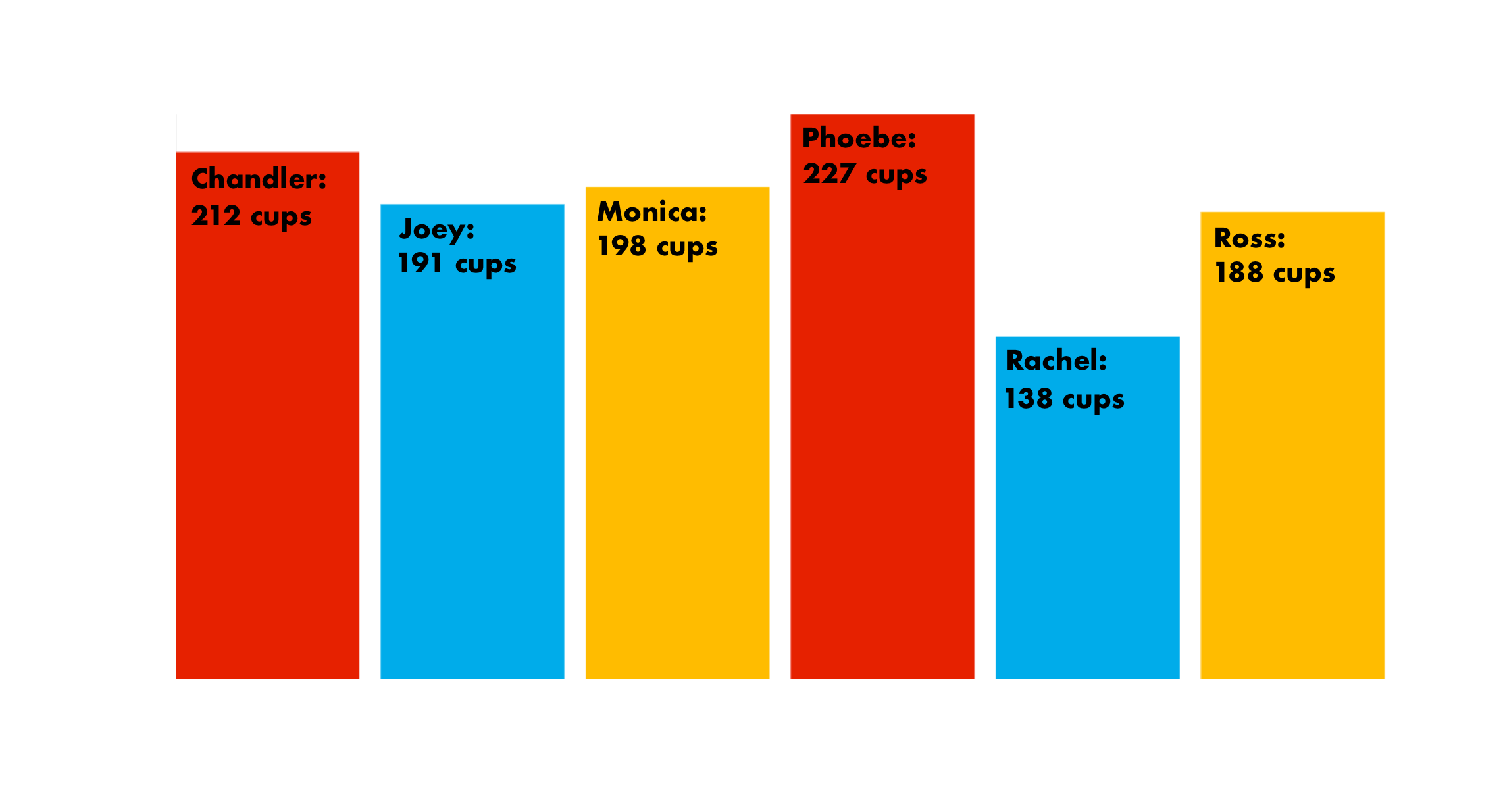
How much coffee did the Friends drink at Central Perk?
Who hangs out with who?

How close is each Friend to the others?

How do the Friends’ romantic relationships progress?

How do the Friends' salaries change over time?


Process and Methodology:
- In order to estimate amount of episode time, we make the assumption that time is proportional to the dialogue word count in the transcripts.
- To measure where the friends spend their time, we summed the total dialogue word count per scene location.
- A relationship is when the character is dating for >3 episodes.
- The data from the 10th season is scaled since it only had 18 episodes vs the usual 24 episodes.
Sources:
- Episode Transcripts found at http://fangj.github.io/friends/
- Episodes viewed on Netflix.com
- Coffee Data found at Buzzfeed’s “So How Much Coffee Did Everyone on ‘Friends’ Actually Drink?”, 2017
- Plot line Data found on The Little Dataset That Could, ‘The One With All the Quantifiable Friendships’, 2015
- Salary Data from the US Bureau of Labor Statistics and glassdoor.com, 2017